Falcon & Ryder
Case Study: Responsive Website

PROJECT OVERVIEW
The Problem
Online custom-made menswear online shopping websites have cluttered designs, inefficient systems for browsing through products and customization options, and long and confusing checkout processes.
The Goal
Design a custom men's clothing website to be user-friendly, with clear navigation, offering easy customization of products, a reliable sizing system, and offering a fast checkout process.
The Product
Falcon & Ryder is a luxury online custom clothing store.
That offers custom tailor-made men's clothing with less time involved than going to see an actual tailor. The typical user
is between 36-56 years old professionals. Falcon & Ryder's goal is to offer a faster way to order custom-tailored-made clothing online that takes less time to receive, high quality, and fits perfectly.
My Role
Creative Director/UX designer leading the Falcon & Ryders website design
Responsibilities
Research, conducting interviews, paper and digital wireframing, low and high-fidelity prototyping, conducting usability studies, accounting for accessibility, iterating on designs and responsive design.
Project Duration
August 2021 to September 2021
$800-$1,800
The price of a custom suit, while
bespoke suits start at $2,800 and
go up to $4,800+
UNDERSTANDING THE USER (including personas and problem statements)
Andre is a busy professional who needs an easy way to order custom tailor-made clothing online that fits him perfectly, takes less time to receive because he often entertains clients, goes to events, and wants to make a great impression.

Andre
Andre is a busy professional who needs an easy way to order custom tailor-made clothing online that fits him perfectly, takes less time to receive because he often entertains clients,
goes to events, and wants to make a great impression.
“Professional appearance is an important step in making a good
first impression.”
About
Age: 42
Education: BS in Computer Science,
JD, Boston, MA
Hometown: Boston, MA
Family: Single
Occupation: Intellectual Property
Lawyer specializing in tech
Goals
-
Less cluttered navigation and layout for faster/easier browsing.
-
Store favorite items and previous purchases to reference
-
Custom sizing for the perfect fit.
-
High quality with faster turn around.
Frustrations
“I find it annoying to have to review size charts for every site I shop on since they are all inconsistent.”
“Shopping website layouts and navigation are confusing and often cluttered”
Andre is a successful intellectual property lawyer working in the tech industry. They have an interest in fashion and a refined sense of taste. They do Crossfit five days a week, entertain clients often, and are actively dating. They don’t have a lot of time to shop but love buying new clothes. However, finding high-quality professional clothing that fits perfectly off the rack or online is near impossible. They prefer custom-tailored-made clothes. However, going to the tailor takes time out of their busy schedule,
the items take several months to get, and the costs can add up quickly.
They are frustrated with their online shopping experience because of poorly designed navigation, overly cluttered websites, extra hidden costs, and customer service representatives that are impossible to get a hold of. They are often disappointed with the quality and poor fit/incorrect sizing because of unreliable sizing systems.
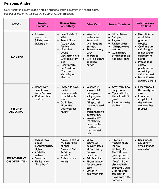
USER JOURNEY MAP
I created a user journey map of Andre experience using the site to help identify possible pain points and improvement opportunities.
SITEMAP
Difficulty with website navigation was a primary pain point for users, keeping that
in mind I create a sitemap.
My goal here was to make strategic information architecture decisions that
would improve overall website navigation.
The structure I chose was designed to
make things simple and easy.

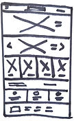
PAPER WIREFRAMES
Wireframes
Next, I sketched out paper wireframes for each screen in my app, keeping the user pain points about navigation, browsing, and checkout flow in mind.
The home screen paper wireframe variations to the right focus on optimizing the browsing experience for users.

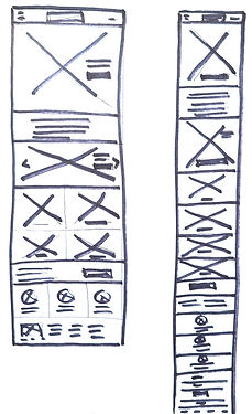
Refined paper wireframe
Stars were used to mark the elements of each sketch that would be
used in the initial digital wireframes.
Screen size variations
Because Falcon & Ryder customers access the site on a variety of different devices, I started to sketch designs for additional screen sizes to make sure the site would be fully responsive.
DIGITAL WIREFRAMES
Moving from paper to digital wireframes made it easy to understand how the redesign could help address user pain points and improve the user experience.
Prioritizing useful button locations and visual element placement on the home page was a key part of my strategy.
Desktop
Easy access to shop products

Tablet

Mobile

Homepage is optimized for easy browsing through the carousel of images and nav
menu options
LOW-FIDELITY PROTOTYPE
To create a low-fidelity prototype, I connected all of the screens involved in the primary user flow of adding an item to the cart
and checking out which you can view here.

USABILITY STUDY FINDINGS
To start testing the designs, I used the low-fidelity prototype to conduct a moderated and unmoderated usability study with five participants. Here are the main finding uncovered but the study.
1
Cart
When adding items to
the cart the users wanted
to know the estimated delivery dates and total purchase price including
tax and shipping
Size
When users selected a
shirt they were confused
on where to add their
custom size
2
Cart
Users want the easy
options of checking
out with Apple Pay
or PayPal
3
REFINING THE DESIGNS
Mockups
Based on the insights from the usability study, knowing that price and delivery is a major factor for any purchasing decision. I made changes to improve the site’s checkout flow. One of the changes I made was adding the total price and delivery when users added items to their cart. This way, there is no surprise at checkout.
Before usability study

After usability study

To make the checkout flow even easier for users, I added the options to checkout using Apple Pay or PayPal that automatically populates most of the users information.
Before usability study
1

After usability study

ACCESSIBILITY CONSIDERATIONS
To start testing the designs, I used the low-fidelity prototype to conduct a moderated and unmoderated usability study with five participants. Here are the main finding uncovered but the study.
1
I used headings with
different sized text for
clear visual hierarchy
I used landmarks to help
users navigate the site, including users who
rely on assistive
technologies
2
I designed the site with
alt text available on
each page for smooth
screen reader access
3


3
I designed the site with
alt text available on each
page for smooth screen reader access
SCREEN SIZE VARIATIONS
I included considerations for additional screen sizes in my mockups based on my earlier wireframes. Because users shop from
a variety of devices, I felt it was important to optimize the browsing experience for a range of device sizes, such as mobile and
tablet so users have the smoothest experience possible.
Desktop
Tablet
Mobile

HIGH-FIDELITY PROTOTYPE
My hi-fi prototype followed the same user flow as the lo-fi prototype, and included the design changes made after the usability
study, as well as several changes suggested by members of my team.


GOING FORWARD (takeaways)
Impact
Our target users shared that the design was intuitive to navigate through, more engaging with the images, and demonstrated a clear visual hierarchy.
What I learned
I learned that even a small design change can have a
huge impact on the user experience. The most important takeaway for me is to always focus on the real needs of the user when coming up with design ideas and solutions.
Next steps
Testing
Conduct follow-up usability testing on the new website focusing on customizations
1
2
Ideation
Identify any additional
areas of need and ideate
on new features
Research
Conduct research on
how successful the customization of
clothing on the website
is for users and their expectations